Where go thou, UX?
A colleague, Alain Stouder of Smartway, shared a link to an interesting article by Bret Victor, “A Brief Rant On the Future Of Interactive Design“. The article intends to make us think about our tools and what technology might become to better serve our needs. As I read I got to thinking about the work of Edward Tufte and Don Norman. Sure enough, the rant included links to other articles by Bret Victor that references Tufte in an article or two, and I have little doubt that Dr. Norman’s work is represented as well. Here are two more of Mr. Victor’s articles.
Magic Ink – Information Software and the Graphical Interface
As we develop new solutions and extend older systems for mobile computing, questions about what goes where and how to get there loom large like dark foreboding clouds. Information needs to be dense and attractive to be useful. Tablets are clearly superior to small devices like phones but are still very constrained. This begs the question of what goes with a tablet to make it truly useful.
There is a real challenge in designing the user experience in a small space. Putting a mobile device on a truck is old hat today. It works precisely because each delivery is neatly contained on single page, even when it is rather long. The format is well suited for the task. This application appears to translate well to other scenarios but as we all know the details are key. One critical threshold will be the amount of data the human needs to complete the task.
For example, software development would be difficult on a tablet. Not only the visual area but the interface. Hand gestures are very cool but can become tiresome. Building a sophisticated application requires a lot of typing. So much that the comparison to the author of literature is still valid. In my own engineering work I use two large monitors and have considered a third, not to mention the white board and paper notes. It is a challenge to conceive of better tools to describe logic for a machine… but there must be a way.
One could argue task decomposition will support smaller interfaces, but the big deal is the density of data and the need to present trends and summations in context of more detailed data. The needs of an accountant may be more than a device the size of a Steno Pad can support.
Walter Venable noted that it is worth comparing the current Apple mobile device information displays to that of the original Macintosh.
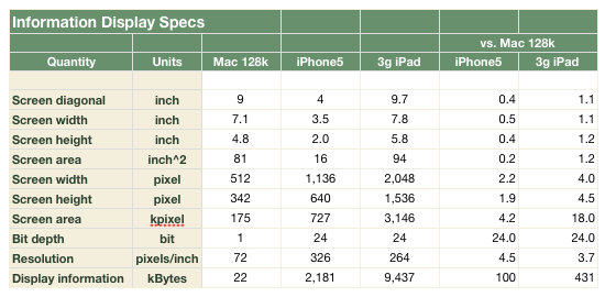
The first Mac computers featured a one-bit black-and-white, 9 in (23 cm) CRT with a resolution of 512×342 (175k) pixels, displayed at 72 pixels/inch (nominal). Thus it renders 175k x 1 bit = 22kB of display information. The recently-released iPhone 5 has a full color 4 in (10 cm) LCD screen with a resolution of 1,136 × 640 (727k) pixels, displayed at 326 pixels/inch, rendering 21.9k x 24 bit = 2.2MB of display information. The 3rd-generation iPad has a has a full color 9.7 in (24.6 cm) LCD screen with a resolution of 2,048 by 1,536 (3,145k) pixels, displayed at 264 pixels/inch, rendering 3,145k x 24 bit = 9.4MB of display information.
So compared to the original Mac, the iPhone5 has 20% of the screen area, 4x the displayed pixels, and 100x the displayed information. Likewise, the 3rd-generation iPad has slightly more screen area, 20x the displayed pixels, and 400x the displayed information.
Now, you may say, just because you have more pixels and more color depth doesn’t mean you can display more text. There’s a limit to how small you can see and also color depth does not translate into more screen real estate. But this doesn’t mean the power to display information isn’t there, it just means that if you want to show properties of large data sets, you have to be more clever about it than just displaying text.
To get full use of the available information display for text, you can use two-finger zooming to quickly go to a place in the display of interest. But as any Mobile Safari user will know, this technique is much more useful in properly-designed graphical displays rather than a page of text, because it doesn’t zoom in on the sentence around the word in the center of the view field, but rather on the rectangular area of the display that would be represented by cutting a rectangle out of a printout of the screen. How 1980’s! The challenge is how to provide useful information about database contents while avoiding text-based presentations.
0 comments